
Page 3 - 남광토건 브로셔(영문)
P. 3
The Namkwang E&C, a company that grew alongside the history of
Korean construction industry, is represented by its corporate mark:
a soft-lined rectangular shape forming the company’s initial ‘N’. This
mark is designed to illustrate the stable yet environmentally friendly
corporate image as well as its flexible characteristic, which is a clear
distinction from the inflexible and conservative image of other preexisting
construction company. This ultimately shows the company’s infinite
possibilities and its client-oriented corporate culture.
Also, the initial ‘N’ epitomizes a high-standing mountain expressing
the company’s second leap towards its advancement as a top-tier
corporation in the industry. The corporate color, Dark Blue, symbolizes
the enterprising and trustworthy standing of Namkwang E&C and PIONEERING THE
the color’s harmonious blend into the background collage signifies
the ‘Namkwang E&C B to B system’ which is a platform designed NEW HISTORY OF
for constant communication and cooperation with the clients. Most
importantly, the well-arranged colors reflects the strong architect’s
will of the company to create an advanced and unique residential CONSTRUCTION
environment.
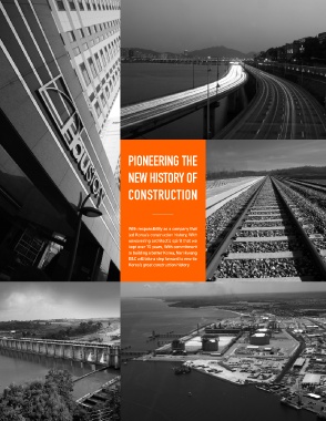
With responsibility as a company that
‘Haustory’, the new title of Namkwang E&C’s apartment, is designed led Korea’s construction history, With
with logic and precision using the golden ratio to allow for a visual unwavering architect’s spirit that we
stability fit for a high class 21st century apartment. Also, the usage of kept over 70 years, With commitment
flashy decorations were minimized to encompass a sophisticated image to building a better Korea, Namkwang
befitting the modern style. E&C will take a step forward to rewrite
The combination of the modern and arranged rectangular shape with Korea’s great construction history.
the avant-garde handwritten English logo well shows that the space is
designed with ration and copious experience of an expert company which
focuses on creation of advanced and creative residential space.
Also by using the corporate color dark blue as the brand color, the brand
shows direct relationship with the corporate image which expresses
confidence in the brand as Namkwang E&C’s representative brand. This
will deepen clients’ trust in the brand as well as maximize the value of
the brand in the long term.
Contents
03 04-05 06-07 08-09 10-11 14-25 26-35 36-39 40-45 46-49 50 51
Pioneer Connect Surpass Incorporate CEO Message Civil Worlk Housings· Architectural Plants·Environmental Overseas History·Awards· Vision Epilogue
Works Works Business Major Experience